The Savvy Whey
Raw pressed Recovery Juice
A Dutch Startup based in Amsterdam set out to make recovery juices for after a workout or on the go.
The Identity
We were commissioned to do the identity and labels for a dutch startup company based in Amsterdam. Savvy Recovery drinks is a raw pressed juice developed initially to rehabilitate patients with long illnesses. It is thus packed with nutritions and therefore perfect for a recovery or as a quick meal after a workout or on the go between meetings.
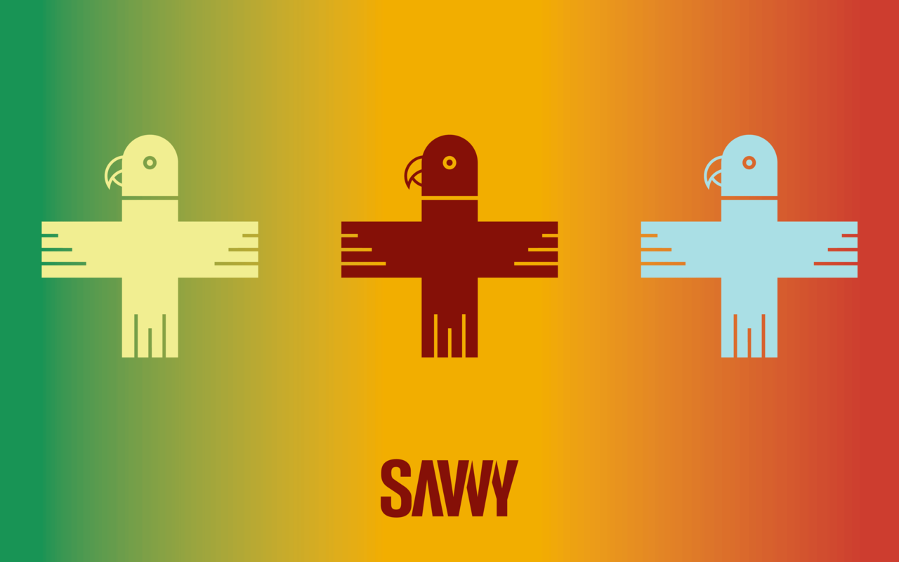
To illustrate the brand we used a stylized Parrot, a bird now native to Amsterdam. It also symbolizes a plus sign, to strengthen Savvy's healthy and additive effect.

The Savvy symbol symbolizing a parrot, a plus sign and a hidden arrow. It works in almost any size, as an icon or as a strong image.

We chose Akzidenz Grotesk light and Bold Condensed for Savvy's typefaces.
The logo type designed with Akzidenz Grotesk using the "V" as an "A" and cutting the double "V's" and "Y" to make it more solid.
Printed Material
Savvy is still a startup and they only needed labels and business cards to start out and sell their product to potential customers and venues, targeting mainly fitness studios at first. We chose three colours contrasting the 3 different juices for the branding on the bottles, and repeated this combination for the business cards.

The three different business cards echoing the colours of the juices and the label on the bottles.

The product has been produced but with different labels. The labels would be printed on transparent background in a contrasting colour to the juices.
- Services Delivered
- Logo and identity
- Label Design
- Illustration