Material Hunter
The finest craft and design
They are a Berlin-based agency specialised in the marketing and sales of design objects.
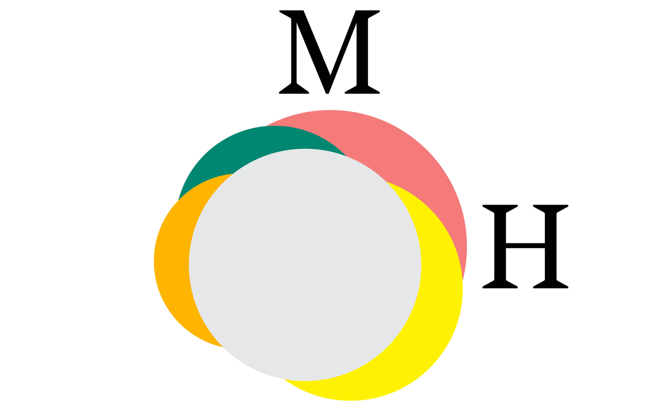
The Identity
Is made up of 3 circles each an abstract representation of objects found by Material Hunter and thus shown as a bullseye. This provides the logo with a playfulness that can contain even new meanings depending on the content of the circles. Variations will follow as the Brand evolves.

The full logo with symbol and brand name. Black is the main colour, but for each season a colour will be added to other content on the website.

The logo consists of three circles that each represent a material and when combined they form a target. The compact logo of Material Hunter is the symbol and each initial M and H.

For Material Hunter we chose Noe Text Semibold and Regular to represent the exclusiveness and finesse that their collection consists of.
The Website
For Material Hunter we designed and developed a one page site to present their collection which is in its early stages. We took great care at designing a site structure that can easily be scaled when faced with the need. The site is built to handle all devices and browsers, with a focus on speed and accesibility.
Desktop Version
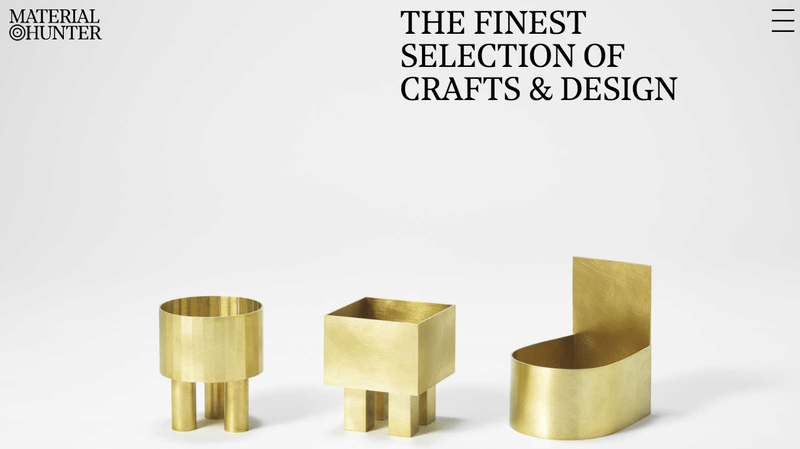
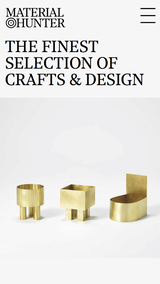
Landing page
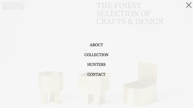
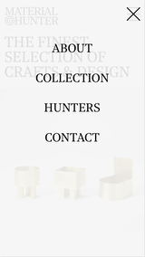
Modal menu
Tablet Version
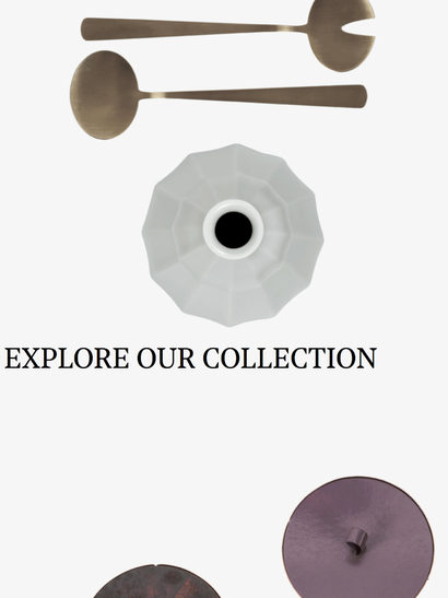
The collection cover image.
The gallery.
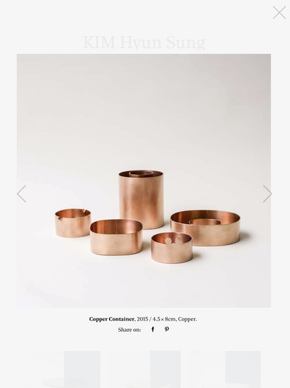
The gallery modal, displaying an item with its details and share buttons.
Mobile Version
Landing page
Modal menu.
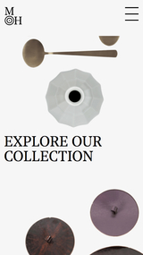
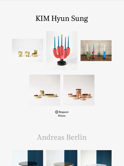
The Collection. A compact version of the Menu sticks to the top, and hides on scroll.
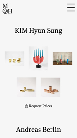
The gallery with thumbnails and recurring details of branding on price request.
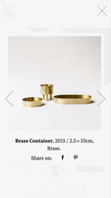
The gallery modal with share buttons
- Services Delivered
- Graphic Identity
- Graphics
- Website
- Art direction