Designtransfer
Rückblick July 2012 – August 2016
A book documenting the past 4 years at "designtransfer", the gallery for the Department of Architecture, Media and Design at the Berlin University of the Arts (UdK).
The Design
We designed the book “designtransfer: Rückblick Juli 2012–August 2016” which contains all the retrospective projects done by designtransfer in the past 4 years. They arrange exhibitions, events, and cooperations which explores topics relevant to each field at the department at UdK. The book is devided into sections which documents each of the activities at the gallery in a chronological order.

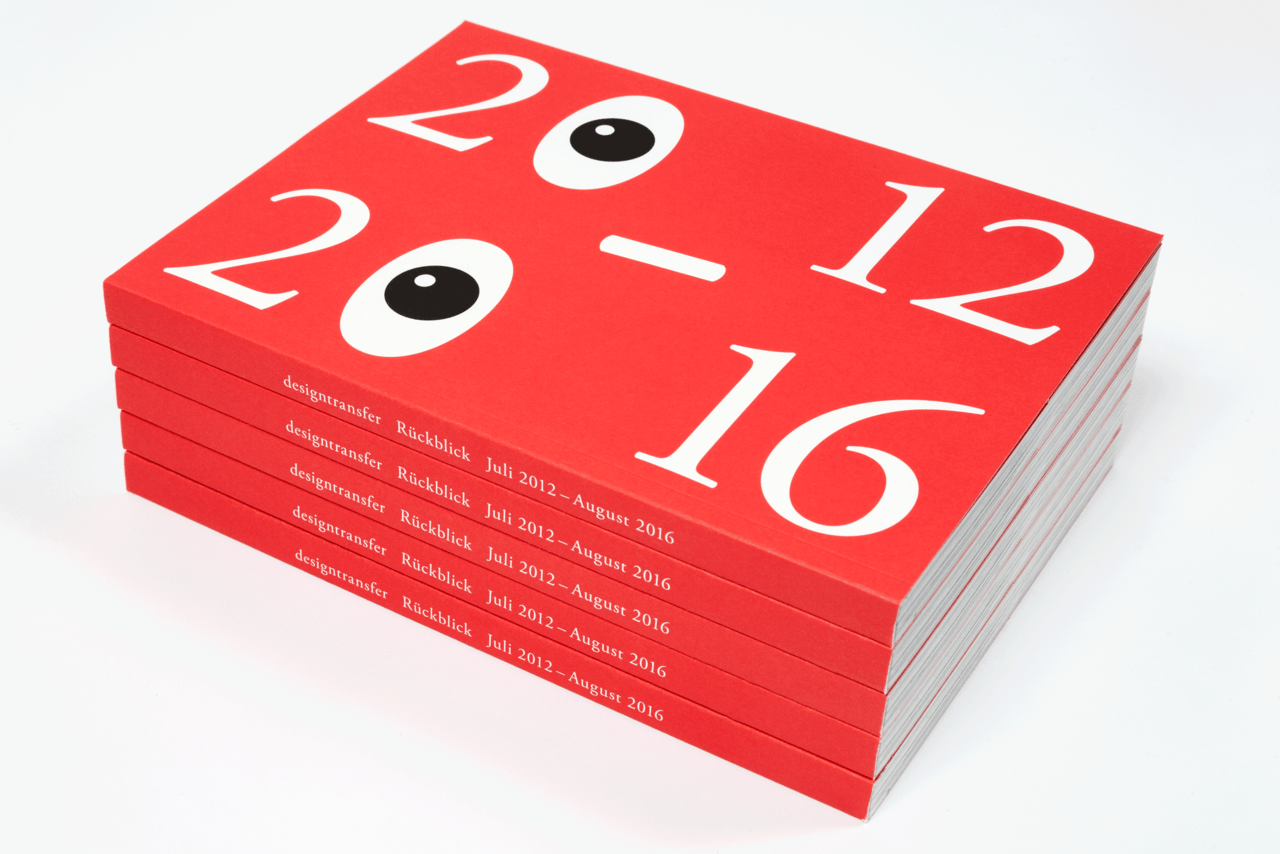
For the book cover we went with a graphic and playful approach made up by the numbers 2012 - 2016 from the title. We illustrated "rückblick” which means "looking-back" by changing the two zeros into a pair of eyes.

We set the whole book and cover in the font “Adobe Garamond Pro Regular”. Beeing in German and English, the layout is designed to hold two different text formats on one page. The German (being the main language) text is placed in the middle of the page and aligned to the left. English sits at the bottom of the page with justified text.
The Book
The book was edited by Ilka Schaumberg, and published by the Verlag der Universität der Künste Berlin. It measures 160 x 220 mm, and has 156 pages. It has the ISBN 973-3-89462-282-4.
You can Download the PDF version(7,9mb)
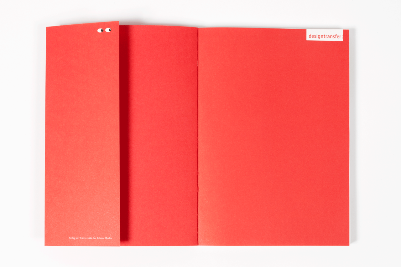
The first "look" behind the cover. Using the flaps of the softcover to repeat the eyes on the front to add some humor to an otherwise neglected corner.
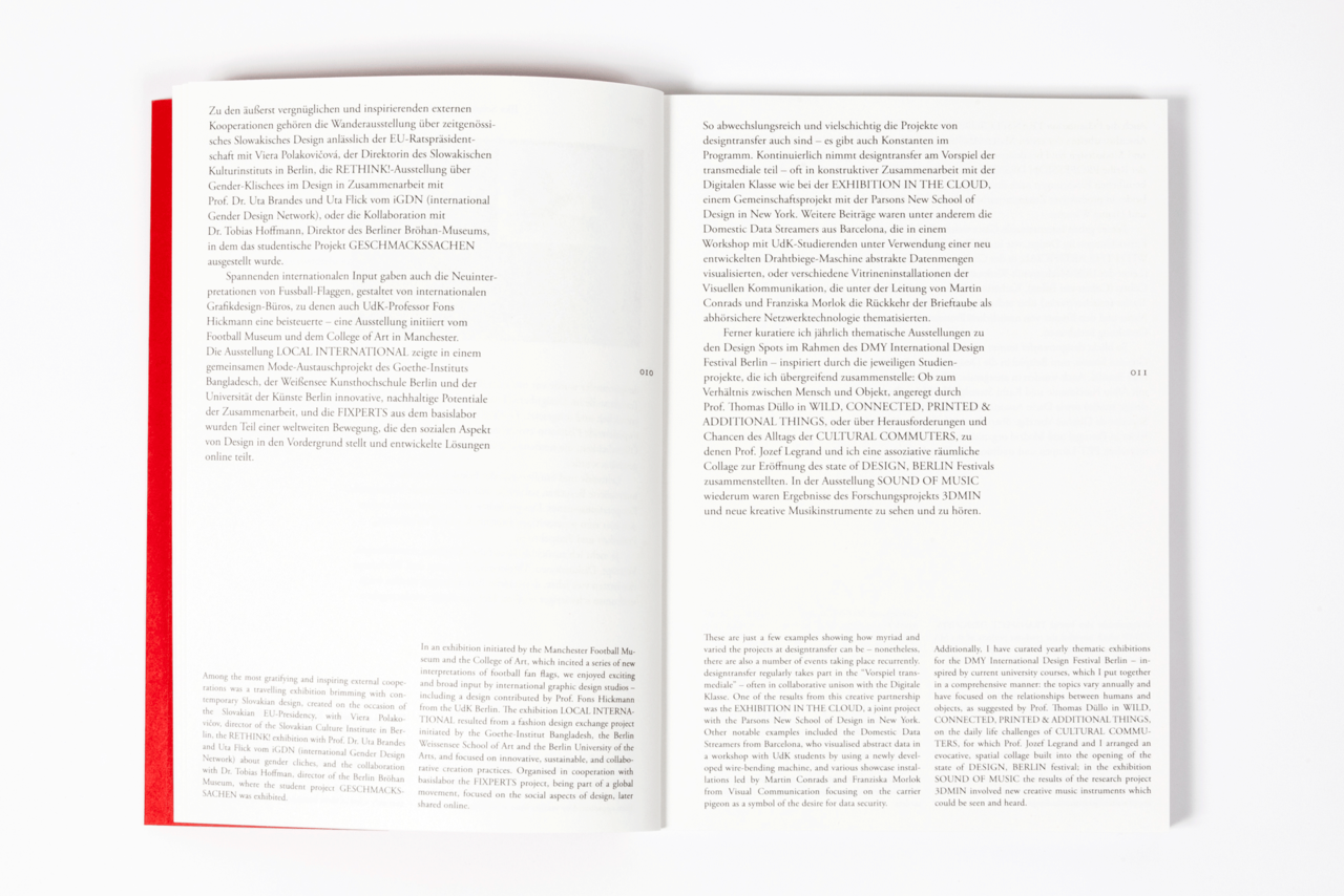
The text in the book is in both German and English, with German beeing the main language. It therefor gets the largest area and is left aligned. The English text is justified and sits at the bottom of the page.

The beginning of a chapter showing the relationship between elements and categories.
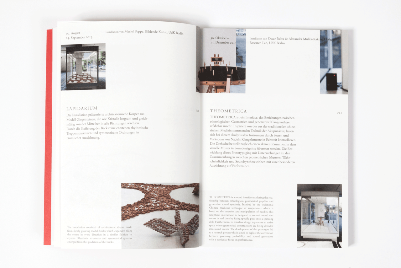
Images do not follow the main grid but are placed as if on a full sheet of paper, bleeding off the page.
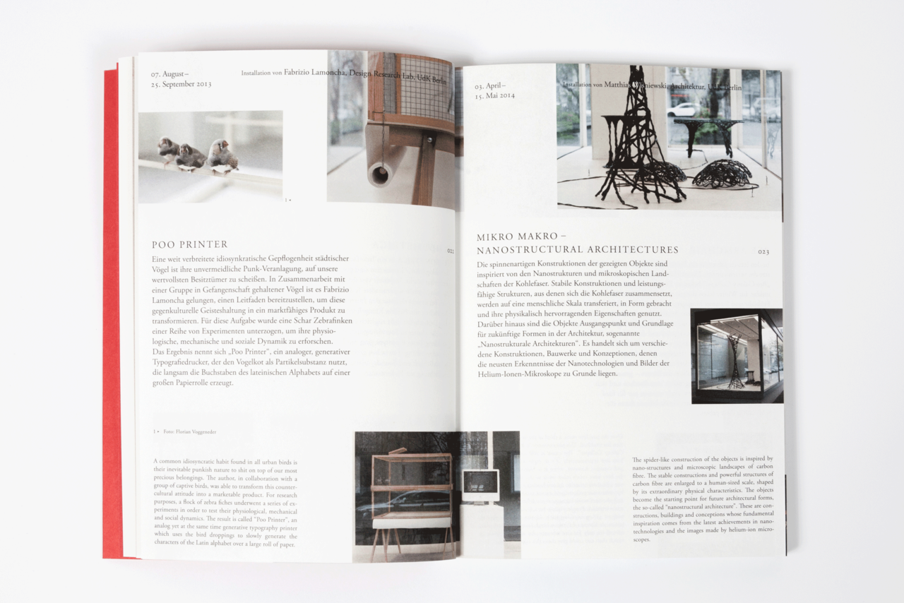
Two projects with overlapping images showing again how the layout works even when images are treated liberaly.
- Services Delivered
- Book Design
- Graphic Identity
- Illustration
- Art direction