Keum Art Projects
A platform for innovative art and design.
They work all over Germany from Berlin to promote a lasting cultural exchange and initiate collaborations between Artists, and collectors .
The Identity
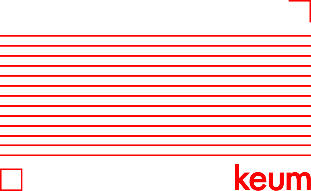
We created a system based on a thorough analysis of their content to redesign Keum Art Projects graphic identity and website. Their new logo has a flexible system which can be playful, frame content, or act as a formal representation. The name is actually written twice, once in Korean and then in latin letters. We use the Korean sign as graphical elements as it is only constrained by a vertical direction.

The latin version of the Keum logo is set in lowercase Futura for maximum form and personality. To get a better harmony we lowered the hight of the "k".
The full logo is built on a grid based on the weight of the latin letters.

The main colour for Keum is black and as a secondary colour we chose a CMYK red which is inspired by asian printmaking tradition for family seals.

The Korean elements can be used in many ways with the logo depending on format and other content.

We chose Roboto Bold for headlines and Regular for text to be used for print and website.
The Website
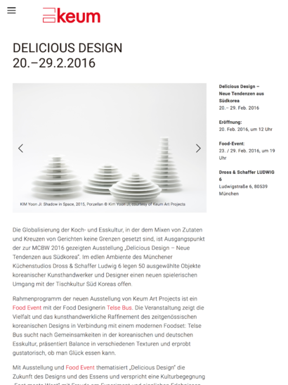
When designing and developing their website we carefully considered their content to construct a lasting structure and user interface, making it work in a responsive way. We simplified the structure and design of the website to be unobtrusive to its content, giving it a "white-cube" approach similar to a physical gallery. This makes it flexible for future content and timeless in design, where the content of Keum's projects can take center stage and the identity and web design second.
Desktop Version

Desktop version of the Keum Art Projects website showing a project.
Tablet Version
iPad version
Mobile Version
iPhone version
Printed Material
We designed a letterhead and two different business cards; one with embossed logo, a DIN A5 as well as a DIN long postcard that could be used at events for notes and flyers.
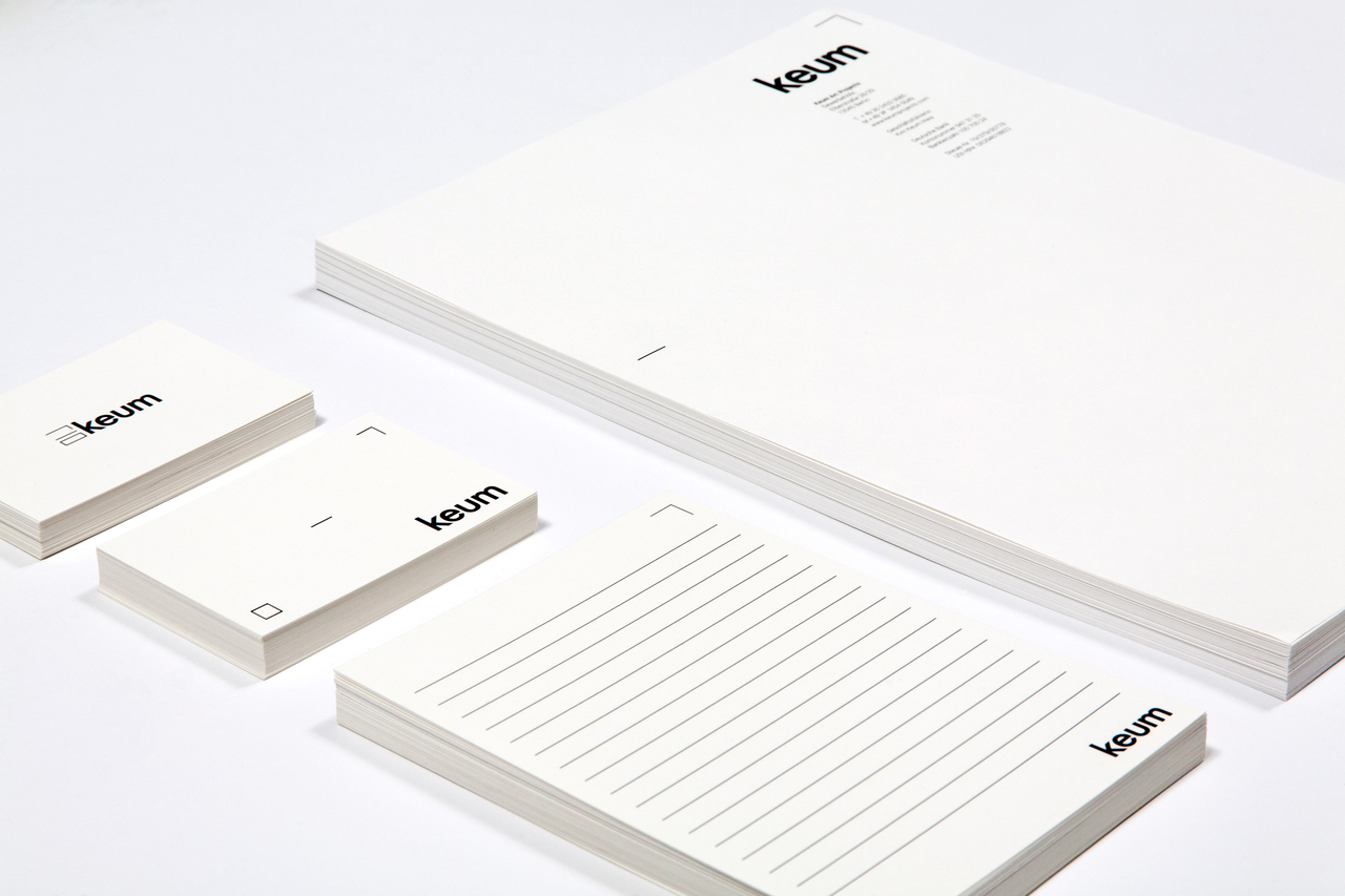
We designed a business card in two versions; postcard and letterhead, each with a playful variation of the identity

The letterhead was printed in red in offset and black for desktop printer. The postcards were printed in two colours and the business cards in two variations: formal and playful.
Brand Guide
We printed a 20 page Brand Manual on beautiful Munchen paper and handed it over as a part of the service showing all the variations of the logo, and how it should be used with other elements and in different settings.
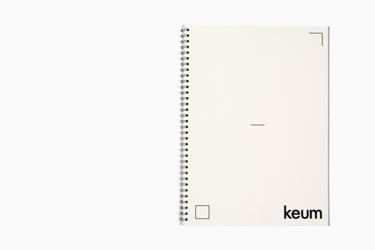
The cover of the brand manual

A page from the brand manual showing the translation and evolution of the logo from latin letters to Korean.

The formal logo in different sizes to show the minimum size and its readability limit.
- Services Delivered
- Graphic Identity
- Website
- Exhibition Materials
- Art direction