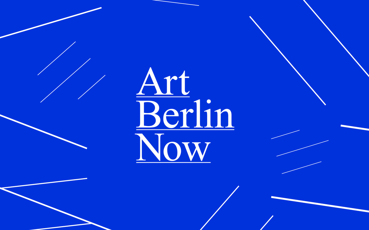
Art Berlin Now
A guided visit to the art production capital Berlin
With a behind the scenes guide to studio spaces of world class Artists, institutions, collections and galleries, ABN takes Korean collectors, professors, and students to places they would otherwise not find.
The Identity
We always saw this project as a link between two places and used the hyperlink as an inspiration. The underline style is used throughout the identity for graphical and informative purposes. The deep blue colour is also a reflection of the hyperlink as is the font Times New Roman, a system font that is well built but has gotten a bad reputation from its status as a system font and general misuse. We liked this challenge and enjoyed finding and emphasizing its beauty and functionality.

The logo of Art Berlin Now in two variations as initials ABN and in full.

For ABN we chose Times New Roman for its latin lettered content and SD Gothic Neo Bold for Korean.
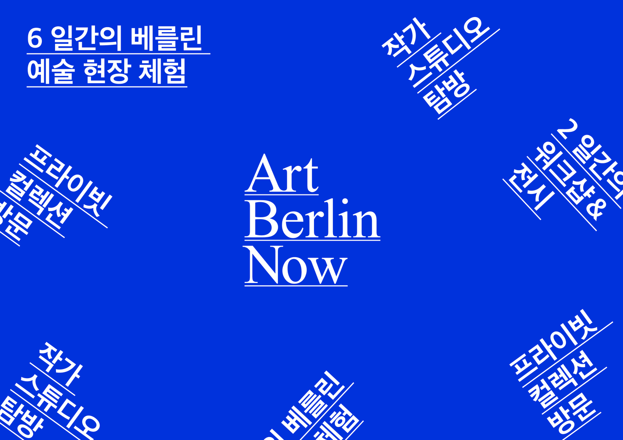
An example of how the identity works with other elements.
Printed Material
For ABN we made a presentation of the project in Korean to be distributed to its target group through the Keum Art Projects website and directly as printed material.

An overview of all the pages from the ABN presentation. The blue colour was used throughout on all elements including images.